Tait and Thistle
I started the design process by meeting with owner Alexa and getting to the core of her vision and intent for the brand. Alexa explained the significance of the brand’s name (her husband’s family name), and their Scottish heritage. I immediately got a feel for what she was trying to convey through the branding/logo for her business. Her key words for the aesthetic were ‘delicate, feminine, handcrafted, bespoke timeless’ and to incorporate neutral tones with a soft, summer palette. She wanted to have branding components that were practical but that enhanced the experience of receiving the products through the post and creating a moment of considered luxury for the customer.
I responded to our initial meeting with a mood board and from there, started doing observational drawings of thistles and writing and re writing ‘Tait and Thistle’ in different formats.
Throughout the design process the customer was at the forefront of the brief - how would they use and re-use the elements - what was the most economical and sustainable way of reinforcing the brands identity? What would be light to post? What would translate well on to 20cm by 20 cm parcel or onto 1m long parcel? How could we convey the brands personality? Alexas taste and attention to detail? To name but a few of the things to consider.
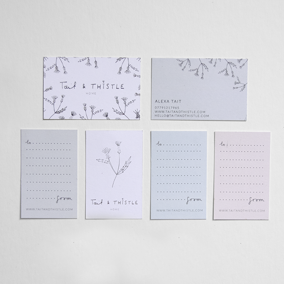
The final components
Hand written logo - this seemed the most appropriate solution - as it gave a nod to the handcrafted and bespoke elements of the brand.
Business cards - 3 different colours to sit back with different products.
Thank you note - To show Alexa’s thanks to every one of her customers and a space for her to write instructions if nescessary.
Rubber stamp - A good brand carrier that could be used on different surfaces ( reinforces handcrafted message).
Range of stickers.
Fabric label.


